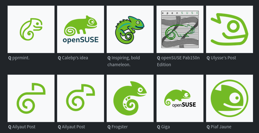
The openSUSE community’s logo contest submission phase is now complete and voting for the logos has begun. This competition marks a pivotal moment for openSU...
The openSUSE community’s logo contest submission phase is now complete and voting for the logos has begun.
This competition marks a pivotal moment for openSUSE and the voting goes until Dec. 10.
Before making any selections, people are encouraged to visit en.opensuse.org/Logocontest and view the logos before voting.
The number of submissions speaks volumes about the community’s enthusiasm and engagement with 18 submissions for Kalpa, 24 submissions for Slowroll, 21 submissions for Leap, 32 submissions for Tumbleweed and an impressive 36 submissions for a potential new openSUSE logo.
The survey was absolute hell on mobile until I actually read the part where it says you can just double click. Made it so much easier. I personally chose the more intricate designs as my favorite and less intricate and more simplified designs as my least favorite. Detailed and intricate designs or nothing for me.
I use Tumbleweed, but I am very aware that openSUSE has the absolute worst logos on the scene—and that this contest will do nothing to change that. Sad.
You are not logged in. However you can subscribe from another Fediverse account, for example Lemmy or Mastodon. To do this, paste the following into the search field of your instance: !linux@lemmy.ml
From Wikipedia, the free encyclopedia
Linux is a family of open source Unix-like operating systems based on the Linux kernel, an operating system kernel first released on September 17, 1991 by Linus Torvalds. Linux is typically packaged in a Linux distribution (or distro for short).
Distributions include the Linux kernel and supporting system software and libraries, many of which are provided by the GNU Project. Many Linux distributions use the word “Linux” in their name, but the Free Software Foundation uses the name GNU/Linux to emphasize the importance of GNU software, causing some controversy.
Rules
Posts must be relevant to operating systems running the Linux kernel. GNU/Linux or otherwise.


The survey was absolute hell on mobile until I actually read the part where it says you can just double click. Made it so much easier. I personally chose the more intricate designs as my favorite and less intricate and more simplified designs as my least favorite. Detailed and intricate designs or nothing for me.
https://youtu.be/LoYP2mEJDJs?si=WQdZBTmWOyGcvhNJ
Here is an alternative Piped link(s):
https://piped.video/LoYP2mEJDJs?si=WQdZBTmWOyGcvhNJ
Piped is a privacy-respecting open-source alternative frontend to YouTube.
I’m open-source; check me out at GitHub.
Can someone explain to me what the fuck are the abominations labeled “Pab150n”?
the calebp one is cute
I really like these two :

The first one is definitely a xenomorph
too bad they’re already doing minimal mono color logos. maybe if one of these designs shifted to adding up all of the colors of the remixes it’d work
Note that there are way more logos than those you see in the preview.
I just hope they don’t ruin the logo with too much minimalism. There are good submission in all of that
I liked the ones that didn’t stray too much from the original. I always liked the gecko, but found it to be a bit weird looking.
pprmint designs are by far superior imo
I use Tumbleweed, but I am very aware that openSUSE has the absolute worst logos on the scene—and that this contest will do nothing to change that. Sad.
I like the chameleon
removed by mod
Giga, but tuck openSUSE closer to the mascot. Use the negative space between the feet and above the open in a clever way.
The Kalpa goatse logo is interesting
Most of them are pretty good IMO
The Leap version logo where there is a line ‘making’ a leap is very clever
The center bottom one looks like the sicp snake.